Choosing the right colors for your home can dramatically affect its mood and atmosphere. Calm colors help create a soothing environment where you can relax and recharge. Whether you’re redecorating a single room or your entire house, understanding how to select and combine these peaceful hues can make a big difference. This guide offers helpful tips to choose calm colors that bring balance and tranquility to your living space.
Why Choose Calm Colors?
Calm colors are typically soft, muted, and gentle tones that encourage relaxation and reduce stress. They can make a room feel cozy and inviting without overwhelming the senses. Common calm colors include soft blues, greens, grays, beiges, and pastels. Using them thoughtfully impacts how you and your guests feel in the space.
Tips for Choosing Calm Colors
1. Understand the Mood You Want to Create
Before picking colors, think about the vibe you want in your space. Are you aiming for peacefulness, warmth, or freshness? Calm colors can lean more toward cool tones, like light blue or mint green, which tend to feel refreshing and serene. Alternatively, warm tones such as muted peach or soft taupe offer a cozy, nurturing atmosphere.
2. Start with Neutrals as a Base
Neutral colors like off-white, cream, light gray, and soft beige are versatile and calming. Using neutral shades as the main color allows you to easily add accents in other calming hues. Neutrals also help other design elements, like furniture and artwork, stand out without clashing.
3. Draw Inspiration from Nature
Nature is a fantastic source of calm colors. Shades inspired by the sky, ocean, plants, and earth—such as sky blue, sage green, or sandy beige—naturally evoke tranquility. Incorporating these tones into your home can create a peaceful, organic feel.
4. Use Color Swatches and Samples
Colors can look very different depending on lighting and room size. Always bring home paint swatches or sample pots and test them on your walls. Observe how the colors change throughout the day with natural and artificial light. This helps ensure you pick a color that feels calm in various conditions.
5. Create Balance with Complementary Shades
Even calm homes benefit from a little contrast. Pairing soft blues with muted oranges or gentle greens with warm neutrals can add depth while keeping a relaxed ambiance. Use complementary colors sparingly in decor items like cushions, rugs, or curtains to maintain balance.
6. Incorporate Texture and Patterns
To prevent calm colors from feeling flat or boring, add variety with textures and subtle patterns. Linen cushions, woven rugs, or light wood finishes introduce tactile interest without disrupting tranquility. Soft patterns, like gentle stripes or organic shapes, blend well with calm palettes.
Popular Calm Color Palettes for Different Rooms
Living Room
Consider warm neutrals like taupe combined with soft blues or greens. These colors work well to create a welcoming space perfect for relaxing or entertaining guests. Accent with wooden furniture and cozy textiles.
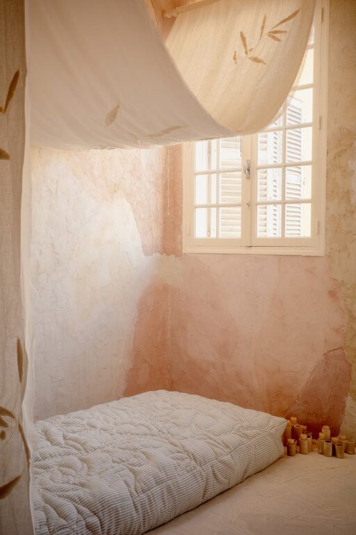
Bedroom
Soft blues, lavender, and light gray evoke restfulness. Pair with whites for a crisp, clean look. Bedding in pastel tones and soft lighting enhance the calm atmosphere.
Bathroom
Cool greens and blues remind us of water and cleanliness. Light seafoam or aqua with white or pale gray fixtures gives the room a fresh, airy feeling.
Kitchen
Muted yellows, sage green, or gentle creams create warmth and calmness. These hues keep the kitchen inviting without overpowering the space where people gather.
Additional Tips for a Calmer Home Environment
– Limit Bold Colors: Use bright or deep colors sparingly as accents rather than main walls.
– Consider Room Size and Light: Lighter calm colors brighten small rooms; slightly deeper tones work in larger, well-lit spaces.
– Use Matte Finishes: Matte or eggshell paints avoid harsh reflections, contributing to a softer appearance.
– Coordinate with Furniture and Accessories: Choose calm colors that harmonize with your furnishings for a cohesive look.
– Keep it Simple: Avoid overdecorating; minimalism enhances calmness and clarity.
Conclusion
Selecting calm colors for your home is about creating an environment that feels restful and balanced. Starting with neutrals, drawing inspiration from nature, and testing samples ensures your choices suit your space and lifestyle. Remember, calm doesn’t mean boring — by combining soft hues thoughtfully with textures and patterns, you can achieve a beautiful, peaceful home that welcomes you every day.
Give yourself time to experiment and enjoy the process of making your home a serene haven. The right calm colors can truly transform the way you experience your living spaces.